foobar2000: 7.1 Finding your way around PanelsUI
This section of the PanelsUI tutorial takes you through the basics of the preferences, and tells you how to make simple changes to the colour scheme.
A quick note
I know that development for PanelsUI has been paused, quite possibly stopped. Please don't email me telling me that my guide is pointless! I still believe this is currently the best UI for foobar, and it is by far the most versatile. There were issues with the 0.14.x release, but the 0.13.x release works beautifully, so you'll have very few issues if you use that. And, just in case the developer(s) of panelsUI happen to read this, please start development again!
Downloading, installing and setting it up
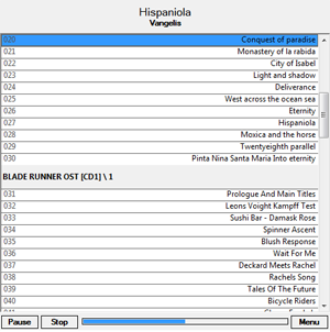
You can download panelsUI version 0.13.x from here. Place it in your components directory as you would with any other component, and when you next start foobar you should get a dialog asking you to choose your UI. Select panels, and you should see your foobar looking something like this:
Looks pretty naff, I know. But this is merely to throw you off guard, as you have not yet supped the raw power under the bonnet.
Layout
The layout is made up of certain panels, such as the "Track Display" panel at the top, showing the song title and artist. Just beneath this is the "Single Column Playlist", which shows the queued tracks (or your entire library if unfiltered) organised into albums. Both of these two components come with panelsUI, and are very powerful. The track display panel in particular opens up almost endless possibilities. Below these panels are the buttons and the progress bar (not seek bar yet, as it isn't clickable), which are self-explanatory. This layout takes up negligible RAM, but you do pay for it in terms of usability!
With the playlist display, all your tracks are grouped into albums. Each album has a group title on a header or banner, called the "group display", followed by the tracks listed one by one, the "track display". The tracks in an album can be selected by clicking on the header once.
Settings
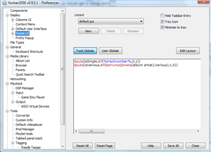
The settings for PanelsUI is in the expected place on the preferences page, in the display tab. Selecting this will produce a window like the following:
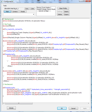
Here is where you can choose the layout, and create new ones. You can also define global variables that can be used throughout all sections of the layout. For the moment, we'll stick with the default layout and just make a couple of aesthetic changes. Just in case something goes wrong, it's best to create a new layout as a copy of the default. Click "new" and name your layout, and your layout will be an identical copy of the default layout. Now click "Edit Layout" to bring up the editing window.
What the...?
Yes, it looks a little confusing. The first time I opened this up, I gave up on the spot. And I couldn't for the life of me find a guide on the internet on how to use it (hence this one)! But after a while I gave it another go, and gradually came to understand it.
What you see in front of you is the main layout editing window. From here everything about the layout is controlled. At the top left of the window, under "Tools", are reference tools for things like menu options, available panels and various things that foobar performs. They don't actually do anything, they're just for jogging your memory for certain options, so you can ignore them for the time being.
To the right of the tools is a display of panels that are included on this layout page. As I showed earlier, there is a track display (called "Playing") and a single column playlist (called "Playlist2"). Each of these can be selected, enabling the "settings" button to the right. Clicking on settings brings up a similar window, but this window contains the layout for that particular panel.
And that's how panels works. Code is broken down into sections, with lots of panels performing different jobs and the main layout referring to each of these panels, and placing them at the right place. As you've probably guessed, the main section of the window is taken up by the code, which describes the layout.
Appearance changes
Just so that the dullness of the default layout doesn't make your eyes bleed much longer, I'll give you a few neat little changes to apply. Wherever the word SYSCOL-xx appears, you can replace this with any colour you want (rather than a boring greyish theme). This is done by replacing the word SYSCOL-xx with an RGB value R-G-B, with the dashes. For example, pencolor-SYSCOL-13 becomes pencolor-255-255-255 for a white border.
Play around with these to find a nice colour scheme. If you want a quick fix, I've made a black and orange themed default layout, which you can get here (click the image):
 Download the black and orange panelsUI theme
Download this file and move it to your foobar directory, to the PanelsUI folder. Restart foobar, and on the panelsUI main preferences window it should appear in the drop-down layout menu.
In the next section I'll go into detail on the code syntax and special panelsUI functions, allowing you to really understand what's going on in these windows and giving you the opportunity to make major tweaks.
Next section: 7.2 PanelsUI code


