foobar2000: 7.2 PanelsUI code
This section goes through the extra, panelsUI specific code. It's not exhaustive, but provides enough to be able to create decent layouts, and to gain a general understanding of how it works.
This section is pretty large, and potentially confusing, so you can use these links to jump to any point on the page.
Introduction
Basic functions
Panel function
Redraw types
Text, font and aligning
Buttons
Appearance functions
Persistent variables
7.2.1 First impressions
The code for PanelsUI is pretty much the same as the general foobar2000 code. However, there are several extra functions, the introduction of "persistent variables" and some usage differences. I'll be referring to code for versions 0.13.x on this page, as it is the most stable.
First of all, you need to bookmark this site. It has all of the PanelsUI-specific titleformatting for version 0.13.x (use this page for version 0.14.x). You should also bookmark the track info panel wiki page, which gives more useful information. You can find information about the single column playlist here.
Practical differences
A very useful difference is that carriage returns, etc. don't affect the result of the code. For example, you could have:
$ifequal (
    a
    b ,
    %result%,
    %alternative_result%
)
The spaces will not be read, where they would be normally. This is great, simply because you can lay your code out neatly and make it readable, by separating a long function out across several lines, for example.
7.2.2 Basic functions
Mathematical evaluation, $eval(...)
In PanelsUI you can use mathematical functions within the $eval(...) function. For example,
$eval( 5 * 6 )returns 30. The operators that $eval() supports are "*" (multiply) "/" (divide), "+" (add), "-" (subtract) and "@" (modulus, returns remainder after division). You can use { and } as brackets for mathematical priority. E.g.
$eval ( { { 9 / 3 } + 5 } * 2 )returns 16.
Defining position and size
There are two ways of defining the position or size of an object using PanelsUI.
The first way is to use pixels, which defines an absolute, static value. This is the result of defining a rectangle 400 pixels by 20 pixels, located at 50px from the left hand side and 70px from the top:
![]()
The other method is to use ratios. The width and height of the panel is given by %_width% and %_height%, and these variables return a pixel value. If you combine these with the $eval function (above), you can define position and size as a ratio of the total width and height. For example,
$eval( %_width% / 3 )returns the pixel value of the total width, divided by three. If the total width was 600, it would return 200. This is useful for creating layouts that can be resized without affecting the appearance.
7.2.3 Panel function
Panels are inserted into code using the following function:
$panel ( id,
    panel,
    x , y ,
    width, height,
    ,
)
id is a name of your choice for the panel, which has to be unique, e.g. "mypanel1"
panel is the name of the panel, e.g. "Track Display" or "Single Column Playlist": the drop-down menus under tools at the top of the window show the panels available
x and y define the position of the panel from the top left corner of the containing panel, in pixels/ratio
width and height define the size of the panel, in pixels/ratio
As an example,
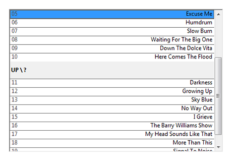
$panel(Playlist,Single Column Playlist,20,20,450,300,)creates a playlist panel, 450 x 300 pixels, 20 pixels from the top left corner:
Don't forget the comma after the panel height. Technically there should be options at the end of the function, but none exist. The function will display nothing if you miss it out though!
7.2.4 Redraw types
A very important feature of PanelsUI is the redraw function. The redraw types tell foobar how regularly the proceeding code should be updated, i.e. every second, or every track, etc. They appear to be comments, in that they are written after two forward slashes, "//". The redraw types are as follows:
// Background- not updated dynamically, use for static objects// Global- anything that doesn't need regular updating can quite happily go here// PerTrack- information that needs to be updated every track, such as%artist%// PerSecond- information that needs to be updated every second, such as%time%
These are also helpful for dividing your code up into sections. If your code isn't displaying properly, just check that it is under the right redraw heading.
7.2.5 Text, fonts and aligning
text
If the panel supports it (e.g. Track Display panel), you can just write text and it should appear on the panel. You can use titleformatting on the fly, such as "The artist's name is %artist%".
For a carriage return, use $char(10), which is a unicode return.
font
Font is defined by the function:
$font ( font,
    size,
    options,
    colour
)
font is the name of the font, e.g. "MS Sans Serif"
size is the font size, e.g. 13
options can be found on the panelsUI titleformatting page
colour is in RGB format, e.g. 132-35-45
An example of this could be:
$font(Calibri,12,,255-255-255).All the text that proceeds this statement will have those properties.
Align with $ALIGNABS
Text will be automatically aligned, but if you want to move it to a particular position you can use the $alignabs(...) function. You define an invisible rectangular area, of particular size and position, within which the text will fit. The function follows this format:
$alignabs ( x , y ,
    width, height,
    h-align, v-align,
)
x and y define the position of the top left corner of the rectangular area, in pixels/ratio
width and height define the width and height of the rectangular area, in pixels/ratio
h-align defines the horizontal alignment of the text in the rectangle, i.e. left, center or right
v-align defines the vertical alignment of the text in the rectangle, i.e. top, middle or bottom
As an example, the following function with text following it:
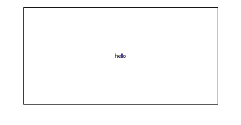
$alignabs(50,20,400,200,center,middle)hellocreates a rectangle at x = 50, y = 20, 400 x 200 pixels, with the text aligned in the center (I've drawn a rectangle around it to show the box):
 $alignabs example
You can also use $alignrel(h-align, v-align) to quickly realign the text horizontally or vertically.
7.2.6 Buttons
There are two types of buttons in PanelsUI, font buttons and image buttons. They can be any size, in any position and perform almost any action. This allows for a lot of freedom!
Image buttons
Image buttons are created by the following function:
$button ( x , y ,
    hotspot-x, hotspot-y,
    hotspot-w, hotspot-h,
    image, hover image,
    command,
    options
)
x and y are the position of the button, in pixels/ratio
hotspot-x and y are the position within the button of the clickable region, leave 0 for whole button to be clickable
hotspot-w and h are the width and height of the clickable region, leave 0 for whole button to be clickable
image and hover image are the paths of the images when unactivated and activated, e.g. "C:\images\image.jpg", without quotes
command refers to the action performed by clicking on the button: the drop-down menus under "Tools" at the top of the window show these actions, also go to the panelsUI titleformatting page for special actions
go to the titleformatting page for options, main option is TOOLTIP:"text", providing a mouseover tooltip
When your mouse hovers over the button, it will change from the image to the hover image. Clicking it activates the command.
Text buttons
Text buttons are created by the following function:
$button2 ( x , y ,
    hotspot-x, hotspot-y,
    hotspot-w, hotspot-h,
    text, hover text,
    command,
    options
)
x and y are the position of the button, in pixels/ratio
hotspot-x and y are the position within the button of the clickable region, leave 0 for whole button to be clickable
hotspot-w and h are the width and height of the clickable region, leave 0 for whole button to be clickable
text and hover text refer to the text shown when activated and unactivated
command refers to the action performed by clicking on the button: the drop-down menus under "Tools" at the top of the window show these actions, also go to the panelsUI titleformatting page for special actions
go to the titleformatting page for options, main option is TOOLTIP:"text", providing a mouseover tooltip
When your mouse hovers over the button, it will change from the text to the hover text. Clicking it activates the command.
7.2.7 Appearance functions
Rectangles
PanelsUI provides a rectangle draw function, with which you can draw a rectangle of any colour and size, and at any position you choose. The function is written as $drawrect(...), and follows this format:
$drawrect ( x , y ,
    a , b ,
    brushcolor-xx pencolor-xx options
)
x and y define the position of the top left corner of the rectangle, in pixels/ratio
a and b are the width and height of the rectangle, respectively, in pixels/ratio
brushcolor is the fill colour of the rectangle, where "xx" can be in the form of "R-G-B", with a 0 to 255 value for each colour, or "SYSCOL-??" (two digits)
pencolor is the outline colour of the rectangle, in the same form as brushcolor
see the panelsUI titleformatting reference for all the options
An example of this:
$drawrect( 40 , 40 , 300 , 20 , pencolor-255-0-0 brushcolor-255-255-255 )This creates a rectangle 40 pixels from the top left corner of the panel, 300 pixels long by 20 high, with a red outline and white fill:

Images
PanelsUI has a two brilliant image display functions, written as $imageabs(...) and $imageabs2(...). They can display an image at a specified size and position, allowing some beautiful layouts if used well. I find that $imageabs2 tends to be more reliable, and gives you far more control over your image display, so it's best just to use that. It is pretty complicated, but I'll try to describe it as well as I can. The format is as follows:
$imageabs2( a , b ,
    left , down ,
    width, height,
    x , y ,
    path,
    options
)
a and b define the area taken up by the image, and the image will expand or shrink to fit it
left and down define the position within the image, i.e. left is how many pixels left from the upper left corner, etc. Rarely needed, so setting both to 0 produces no effect
width and height define the cropping width and height. If they are the same as the image size, nothing changes. If they are set to 0 then there is no cropping. If they are set to less than the width or height of the image, the image is cropped to that size
x and y define the position of the top left corner of the image from the top left of the window or panel, in pixels/ratio
path is a reference to the image location on your computer, e.g. "C:\images\image.jpg", without quotes
see the track panel info page for all the options, some include rotating and flipping the image, applying transparency and choosing to retain aspect ratio when resizing
An example of this in use would be something like this:
$imageabs2(250,250,0,0,0,0,20,20,C:\foobar\cdcase.png, nokeepaspect )This displays "cdcase.png" at 250 x 250 pixels, placed at x = 20, y = 20 in the panel, with no cropping and ignoring aspect ratio:
 An example of $imageabs2 in use
The best way to learn this function is by trying it out with different options and cropping. A good use is in displaying artwork within the single column playlist or track display panel.
7.2.8 Persistent variables (PVARs)
PVARs are variables that, dammit, just won't go away. If they are assigned a particular value, they have to be explicitly told if that value is to change. In any section of the layout the PVAR can be called upon, and its value will remain consistent. It is useful for creating multiple scenarios within one layout. For instance, you could create a mini-layout and a full-screen layout, and a button click could swap between them. The button click will change the value of the PVAR, and your code will be seperated into two sections, with each section functioning only when the PVAR has a particular value. This may sound confusing, but we'll do some practical stuff in the next section so you can pick it up.
A PVAR is defined with the following:
$setpvar( mypvar, value )and recalled with:
$getpvar( mypvar ).Next section: 7.3 Creating a PanelsUI layout


