foobar2000: 7.3 Creating a PanelsUI layout
In the last section of this PanelsUI tutorial we'll go through creating a layout, step-by-step. It would help to have an understanding of PanelsUI code syntax, so check the previous page if you don't.
7.3.1 Here's one I tried to make earlier
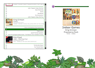
We are going to create this:
It's pretty simple, and mediumly (new word) attractive, but it will do.
7.3.2 New layout
Firstly, head to the preferences (Ctrl+P), and then to the Display section. Make sure PanelsUI is selected. If it doesn't appear in the drop-down menu, you've been a muppet, and have started a PanelsUI tutorial without having PanelsUI. So download it. Head to the PanelsUI sub-menu, and create a new layout. Call it something. I called mine "foliage", during a brief lapse of imagination. Now, download my little images pack:
This contains all the images you need for the layout. Unzip it somewhere convenient on your hard drive, such as "C:\foobar\". Now go back to the PanelsUI preferences page, where you created the new layout, and click on the "User Globals" button. Then add the line
[php light="1"]$puts(imgpath,C:\foobar\foliage)[/php]
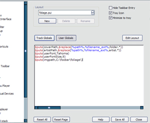
on a new line in the box. If you unzipped the images somewhere else, modify the line to show the path of the containing folder. If you can't find the user globals page it should look something like this:
This allows us to call on a variable each time we want to find our images folder, rather than writing out "C\foobar..." each time. You can do this with anything, such as fonts or colours. Since this is a simple layout, we won't do any more.
7.3.3 Writing the code
Now we're going to edit the code for the first time. Click on "Edit Layout" on the PanelsUI preferences window, and select all the code from the new box that appears. Delete it. All of it. Show it no mercy. Click apply, and everything will disappear, probably giving you a black screen. The box you have before you contains the information for the layout. Within this section you can "call" on other panels, which sometimes have their own edit window, and those panels will be incorporated into the layout. In the top right corner of the edit window you should see something like this:
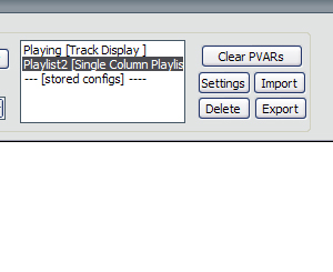
This box shows you which panels you currently have associated with that layout. Since we've deleted everything, they're not doing much, so we can delete them too. Select each one and click delete to the right. Now you have a clean sheet. The first step is going to be adding the background. Write (or copy) the following text:
// Background
$drawrect(0,0,%_width%,%_height%,brushcolor-255-255-255 pencolor-null)
$imageabs2(1200,1000,0,0,0,0,$eval(%_width%-1200),$eval(%_height%-1000),$get(imgpath)background.png,)
The top tag tells foobar that everything following it is in the "Background" category, and therefore doesn't need to update dynamically. Saves some processing power. The $drawrect function is a box that fits the entire size of the layout, and creates a white background (as opposed to the default black). This function can confuse people, but it is literally just drawing a rectangle and colouring it in. The $imageabs2 function is our background image, and I've used a little bit of maths to place it. The image is 1200 by 1000, and it is positioned at the full width minus 1200 (i.e. the far right edge of the layout) and the full height minus 1000 (i.e. the bottom edge of the layout). So the leaves will always be in the bottom right corner of the layout. This allows us to have a stretchy layout, that still looks good. The $get(imgpath) is referring to the user global that you set earlier, and leads to the image path. Click apply; if the image doesn't appear, make sure the user global is correct.
7.3.4 Adding panels
Next we'll add some panels. This layout uses only three panels: Single Column Playlist, Track Display and Quick Search (see components page, first two included with panelsUI). Again, the positioning of these panels involves a bit of maths to create a fluid layout that stretches. They need to be under the "Globals" tag, so type the following code:
// Global
$panel(Playlist,Single Column Playlist,50,45,$eval(4*%_width%/9),$eval(2*%_height%/3),)
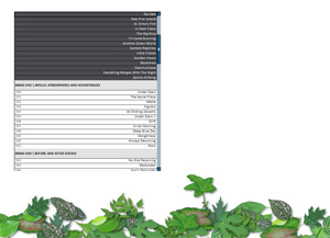
The single column playlist (named as "Playlist" in this case) is positioned at 50px from the left, 45px from the top. The width is 4/9 of the overall width of foobar. The height is 2/3 of the overall height. If the foobar is stretched, the panel will stretch with it. Click "Apply" and the following will appear:
You should also notice that the panel gets listed in the top right box on the edit panel. If it doesn't appear... something's wrong. Er... email me.
Now, we'll add the track display panel, which is a very versatile tool for showing current information, displaying pics, etc.
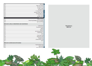
$panel(Display,Track Display,$eval(%_width%/2+30),60,$eval(4*%_width%/9),$eval({2*%_height%/3}-15),)This is positioned at half the width plus 30px, and 60px from the top. The width is 4/9 of the width of the foobar, and 2/3 of the height, minus a little bit. Click "Apply". The result will look like this:
Pretty, innit? We'll make it a bit nicer.
7.3.5 Single Column Playlist editing
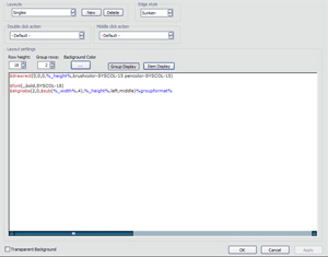
First we'll make some changes to the single column playlist. Select the panel in the top right section of the edit window, and click "settings". You should then see a window that looks like this:
The only part of the window we're interested in is the section called "layout settings". The single column playlist has two sections: the group display and item display. The group display is for showing information such as album and artist title, and the item display shows each track within that group. You can change the height of the items in the top left of the layout settings. The default is 18 pixels, and we want ours to be 21 pixels. You can also change the height of the group display, and it is a multiple of the item height. The default is 2, and we want to have it as 5. Click apply, and you should see the playlist dimensions expand.
Group display
Currently the information in the group display is a bit ugly, so we'll just start again from scratch. Make sure that the group display button is selected in the layout settings section, and delete all the code. Then add the following code:
// Background
$imageabs2(%_width%,400,0,0,0,0,0,0,$get(imgpath)box.PNG,nokeepaspect)
$drawrect(20,$eval(%_height%-10),$eval(%_width%-40),2,brushcolor-null pencolor-50-140-50)
As you've probably picked up, the // Background tag means that the following code doesn't have to update regularly. The $imageabs function places an image of a rounded-corner box in our group display. The $rect function draws a green line which will just provide a nice green line to underline all the information we're about to display. Click apply to see the changes (in fact, just do this whenever you change stuff from now on - I'll stop saying it).
Next we'll write out information about the album, such as the artist, album name and genre. It's also preferable to show the album artwork, but it depends on 1) whether you have any, and 2) how organised you've been with it. I have all of my album artwork sitting within the folder which contains my music files for that album, and I've always called it "cover.jpg". Others have all their artwork within one folder, and the name of the image is related to the album title. I prefer having everything within one place. If you don't have album artwork then just skip this code. Otherwise, write this:
// Global
$drawrect(20,10,80,80,pencolor-150-150-150 brushcolor-null)
$alignabs(20,10,80,80,center,middle)no image
$imageabs2(80,80,0,0,0,0,20,10,$replace(%path%,%filename_ext%,cover.*),)
The $rect function draws a little grey box where the album artwork will sit, which you should only see if the album artwork is missing. It's better than having a white space! The $alignabs function creates an invisible box which you can use to align text with respect to the left and top of the containing box. For instance, this box is 20px from the left, 10px from the top and is 80x80px in size. The text is aligned in the center of the box, and says "no image". Again, this will only appear if there is no image to display. The image function is obviously the one that displays the artwork, but the path is a bit more complicated. The $replace function basically adds "cover.*" (where * is an extension wildcard, i.e. jpg, gif, png...) to the path of the album. If your album artwork is called anything else then just change "cover" to whatever. Now we'll move on to displaying the album information.
// Global
$font(verdana,14,,90-90-90)
$alignabs(110,10,$eval(%_width%-20),%_height%,left,top)
$ifgreater($len(%artist%),$eval(\{\%\_width%-150}/10),$padcut(%artist%,$eval({\{\%_width%-150}/10}-2))...,%artist%)
$char(10)
Note - you only need to write // Global if you didn't include the album artwork bit above. Firstly, the $font function sets the font, which I've defined as Verdana, 14pt and a darkish grey. The font will remain as this until it's redefined. The $alignabs function draws an invisible box to place the text (see above). If you didn't include the album artwork, set the value for x-position (i.e. 110) to about 30. Otherwise, keep it the same.
The next function looks extremely evil, but I'm actually quite proud of it. It cuts the artist's name depending on the width of the box, e.g. "Dave Matthews Band" would become "Dave Matthe..." if there isn't enough room to display it. Remember that our layout is fluid, so increasing the size of your foobar will increase the size of the single column playlist, and the cutting will adapt automatically. The final function, simply $char(10) is an ASCII character return, meaning new line. Next we'll do similar stuff for other information.
$font(verdana,12,,90-90-90)
$ifgreater($len(%album%),$eval(\{\%_width%-150}/8),$padcut(%album%,$eval({\{\%_width%-150}/8}-2))...,%album%)
$char(10)
$font(verdana,8,uppercase,140-140-140)
%genre%
$char(10)
%codec% - %bitrate%kbs
These functions have all been covered, and should make sense. They just show the album name, genre and then codec and average bitrate for the album. Now we've finished with the group display.
Item display
Next we'll move on to the "item display" section - click the appropriate button in the playlist edit window to change. Then delete all the code in the box, and write the following lines in:
// Global
$if(%_selected%,$drawrect(12,0,$eval(%_width%-24),0,brushcolor-20-120-20 pencolor-null))
$if(%_focused%,$drawrect(12,0,$eval(%_width%-24),0,brushcolor-null pencolor-SYSCOL-6))
$if(%_selected%,$textcolor(225-255-225),$textcolor(60-60-60))
The top $if function draws a green rectangle, almost the width of the playlist, if the item is selected. The second function draws a black outline round an item if it is focused upon, which is slightly different. To see the difference just select several items by clicking on an item, holding SHIFT and clicking on another item. Several are selected, but only one shows the black border. The third function defines the colour of the text when selected (white in this case) and unselected (dark grey). Next bit of code:
$imageabs2(%_width%,$eval($meta(TOTALTRACKS)*20+22),0,$eval(%tracknumber%*20),0,0,0,0,$get(imgpath)box.png,nokeepaspect)
$padding(20,3)
$align(right,top)%title%
$align(left,top)%tracknumber%.
The image function is pretty complicated here. The image is a round corner green box, and this function draws a little section of it for each of the items. Each item in the single column playlist is treated as an isolated element, so drawing an image will draw that image on each item. But this function offsets the position of the image with each item, and it depends upon the tracknumber and the total number of tracks in the album. If the track number is equal to the total number of tracks then the end of the image is shown, which shows the curved corners (don't worry if you don't get this).
This is another function I'm kind of proud of, although the problem is that the image gets squashed or stretched depending on the number of tracks in the album, which isn't ideal. Also, if your track information isn't complete, for example if you don't have the number of tracks in the album (you can add it in the track properties dialogue), it won't display properly. The align functions display the track title (on the right) and the track number (on the left).
Congratulations, your single column playlist is complete! It should look like this:
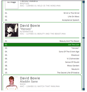 Completed single column playlist editor
Finally, in the top right of the single column playlist edit window, where it says "Edge style", change it to "none". Now close the single column playlist edit window, to return to the main edit window.
7.3.6 Track display editing
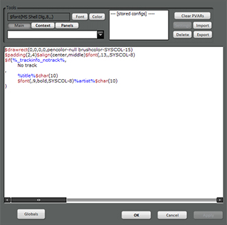
Open the track display panel edit window using the box in the top right corner of the window. You should see this:
Song description
This code makes the track panel look pretty ugly. Delete everything in the central text box, and replace it with the following:
$padding(2,4)$alignabs(0,250,%_width%,$eval(%_height%-50),center,top)
$font(Verdana,22,,70-70-70)
$if(%_trackinfo_notrack%,
No track
,
%title%$char(10)
$font(Verdana,15,,80-80-80)%artist%$char(10)
$font(Verdana,15,,90-90-90)%genre%$char(10)
$font(Verdana,10,,100-100-100)%codec% - %bitrate%kbs
)
$imageabs2($eval(%_width%-80),10,0,0,0,0,40,15,$get(imgpath)bar.png,nokeepaspect)
I'll walk you through it. The first two commands, $padding and $alignabs, are defining the dimensions and position of a bounding box, in which we can put text, etc. The $font command is self-explanatory, and we've seen it before. The $if function works out whether a track is playing, and displays "No track" if there isn't. Otherwise, it displays the song title, artist, genre and track information in that order. Finally, the $imageabs2 function displays the image that we'll use for the progress bar.
Progress bar and artwork
Adding the progress bar is a relatively complex step, and requires the powerpanels component. This is now pretty hard to get, since the official site seems to have gone down (as of 04/02/2009). However, I will provide a link to it here, and will continue to do so until someone complains:
Plonk this in your components folder in the foobar directory, and restart foobar. Go back to the track display edit window as previous, and add the following code:
// PerTrack
$drawrect($eval(%_width%/2-100),40,200,200,pencolor-0-100-0 brushcolor-null)
$imageabs2(200,200,0,0,0,0,$eval(%_width%/2-98),44,$replace(%path%,%filename_ext%,cover.*),nokeepaspect)

// PerSecond
$if(%isplaying%,$puts(l,$eval($eval(%_width%-80)*%playback_time_seconds% / %length_seconds%))
$imageabs2(38,39,0,0,0,0,$eval(18+$get(l)),0,$get(imgpath)slider.png,nokeepaspect)
,)
The first two functions, i.e. $drawrect and $imageabs2, draw a square border and place the track artwork respectively. The functions under the // Per Second group work out the length of the song, the current position, and place the image of the slider along the progress bar accordingly. You can follow my maths through if you want, but I won't.
That's all for the track display panel: almost finished! After applying the changes you've just made, your foobar should look pretty close to this:
Although you probably won't be playing anything from Lizard by King Crimson.
7.3.7 Final adjustments
Exit the track display edit window, to get to the main configuration window. Here, the most recent things you added were the bits of code that called the track display and single column playlist panels. Everything in this section can be placed after these commands.
Quick search toolbar
This requires the Quick Search Toolbar component, which you can download here:
You know what to do. After putting it in your components directory, add the following code to the configuration screen:
$panel(Searchbar,Quick Search Toolbar,50,$eval(2*%_height%/3+55),$eval(4*%_width%/9),23,)This places a search toolbar underneath the single column playlist. Right click on the toolbar to change the fields that you search for, and use it to quickly grab things from your library. You can edit it in the preferences.
Some rectangles
We're going to draw some boxes around the playlist and track display. Just add the following code to the configuration window:
$drawrect(48,43,$eval(4*%_width%/9+4),2,pencolor-0-100-0 brushcolor-null)
$drawrect(48,$eval(2*%_height%/3+45),$eval(4*%_width%/9+4),2,pencolor-0-100-0 brushcolor-null)
$drawrect(48,45,2,$eval(2*%_height%/3),pencolor-0-100-0 brushcolor-null)
$drawrect($eval(4*%_width%/9+50),45,2,$eval(2*%_height%/3),pencolor-0-100-0 brushcolor-null)
$drawrect($eval(%_width%/2+28),43,$eval(4*%_width%/9+4),2,pencolor-0-100-0 brushcolor-null)
$drawrect($eval(%_width%/2+28),$eval({2*%_height%/3}+45),$eval(4*%_width%/9+4),2, pencolor-0-100-0 brushcolor-null)
$drawrect($eval(%_width%/2+28),45,2,$eval(2*%_height%/3),pencolor-0-100-0 brushcolor-null)
$drawrect($eval(%_width%/2+30+{4*%_width%/9}),45,2,$eval(2*%_height%/3),pencolor-0-100-0 brushcolor-null)
Although this may look complicated, it's just drawing a series of 2px solid lines, at the edge of the single column playlist and track display panels. It requires a little bit of working out to determine where the edges are, but it's a simple idea.
Power Panel
Finally, we're going to add the power panel, which is an invisible seekbar that can be used to navigate through a track. You have to define the dimensions, but the panel works out all the difficult stuff. The way to use it is to place it underneath the progress bar that we've created for the track display. Put in the following code in the configuration window:
$panel(Seekbar,Seek Panel,$eval(%_width%/2+70),70, $eval(4*%_width%/9-80),20,)Now play a song, and click anywhere along the progress bar. You should (hopefully) find that the song jumps depending on where you click the bar. If that doesn't work, check that the component has been successfully installed (Preferences -> Components -> Seek Panel). If it says it is, send me a message and I'll try and figure it out.
7.3.8 Final words
You should now have a working PanelsUI skin. It's pretty basic, and not particularly pretty. But it does the job! Hopefully I'll get round to making some attractive skins, if other stuff doesn't get on top of me. Here is the complete PUI file, and the images pack again.
All that, just to listen to music?!


